æternity: the Blockchain for all
Aeternity is a scalable blockchain platform that enables high-speed transacting and purely-functional smart contracts. The platform aims to help people benefit from a global sharing economy based on decentralized systems and individual merit.
How we helped
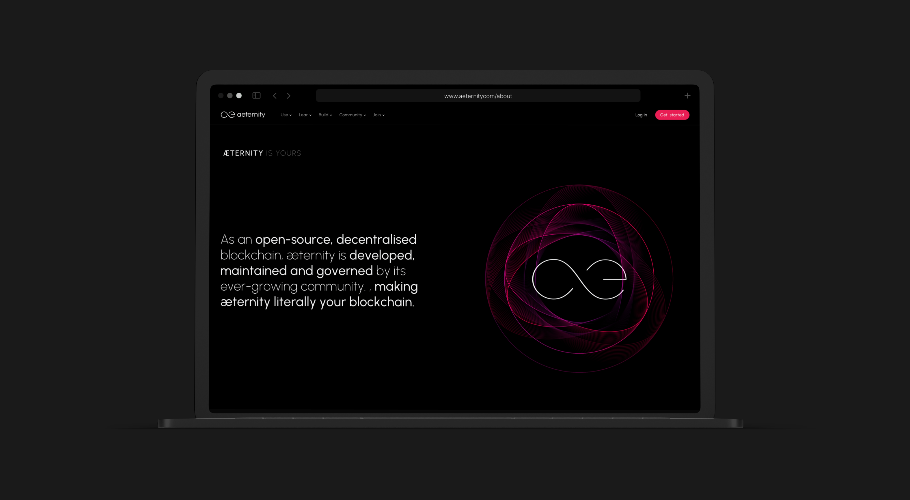
We created a new set of branding guidelines and corporate identity for Aeternity, which included a refreshed color scheme, and a completely new website with extensive knowledge base.
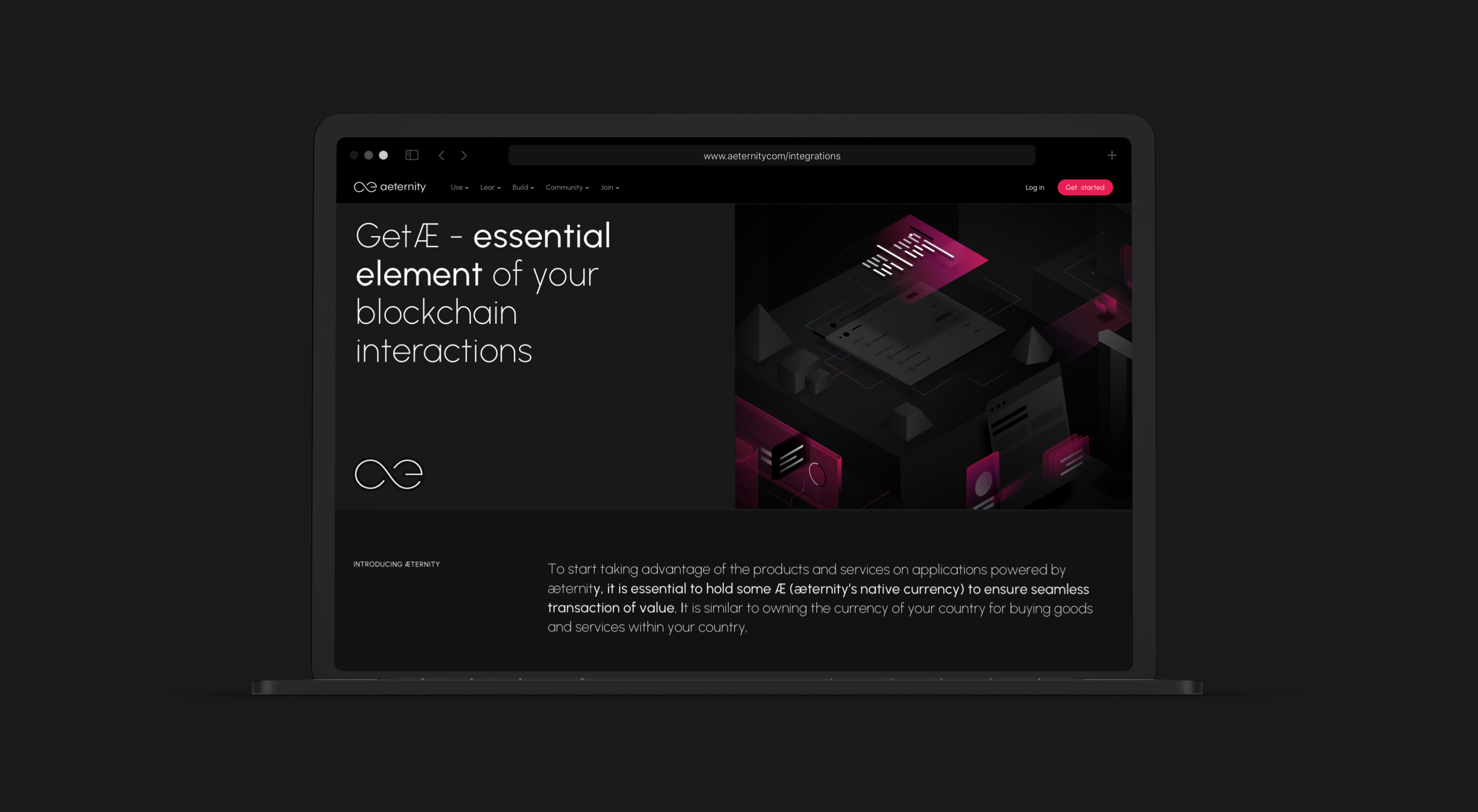
The new website, color scheme, and typography all work together to create a unique and memorable visual experience that truly represents the cutting-edge technology of aeternity.
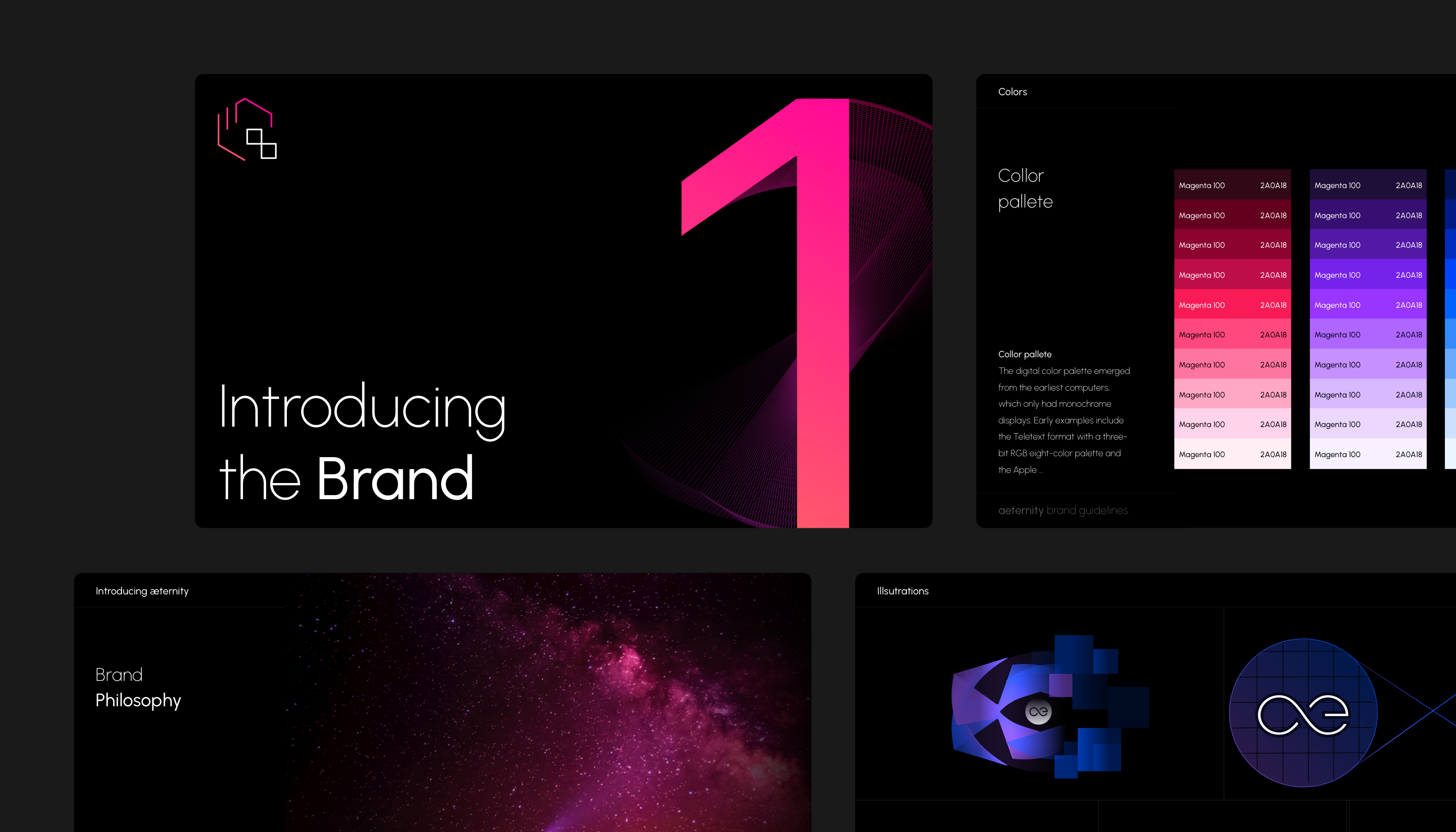
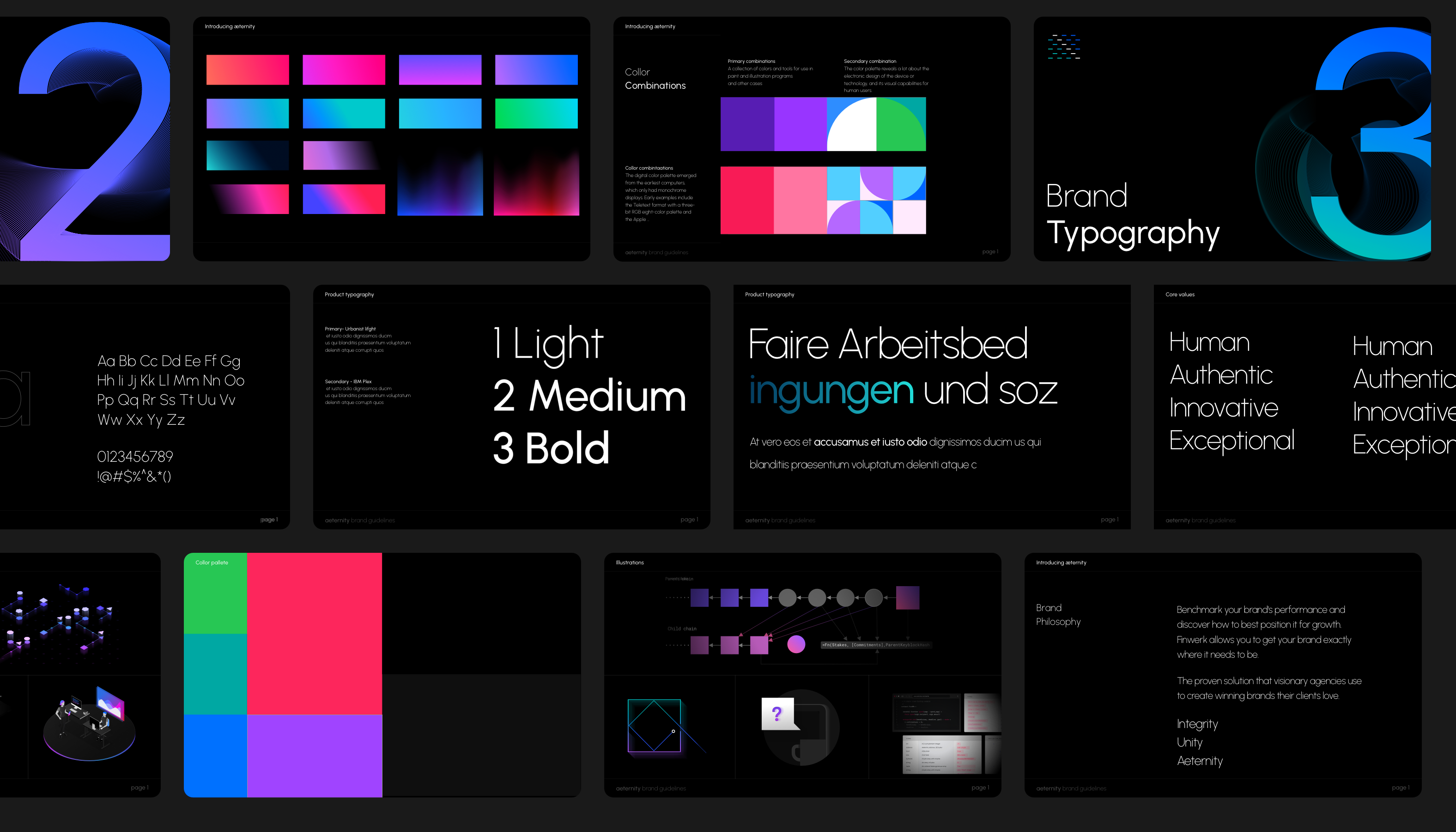
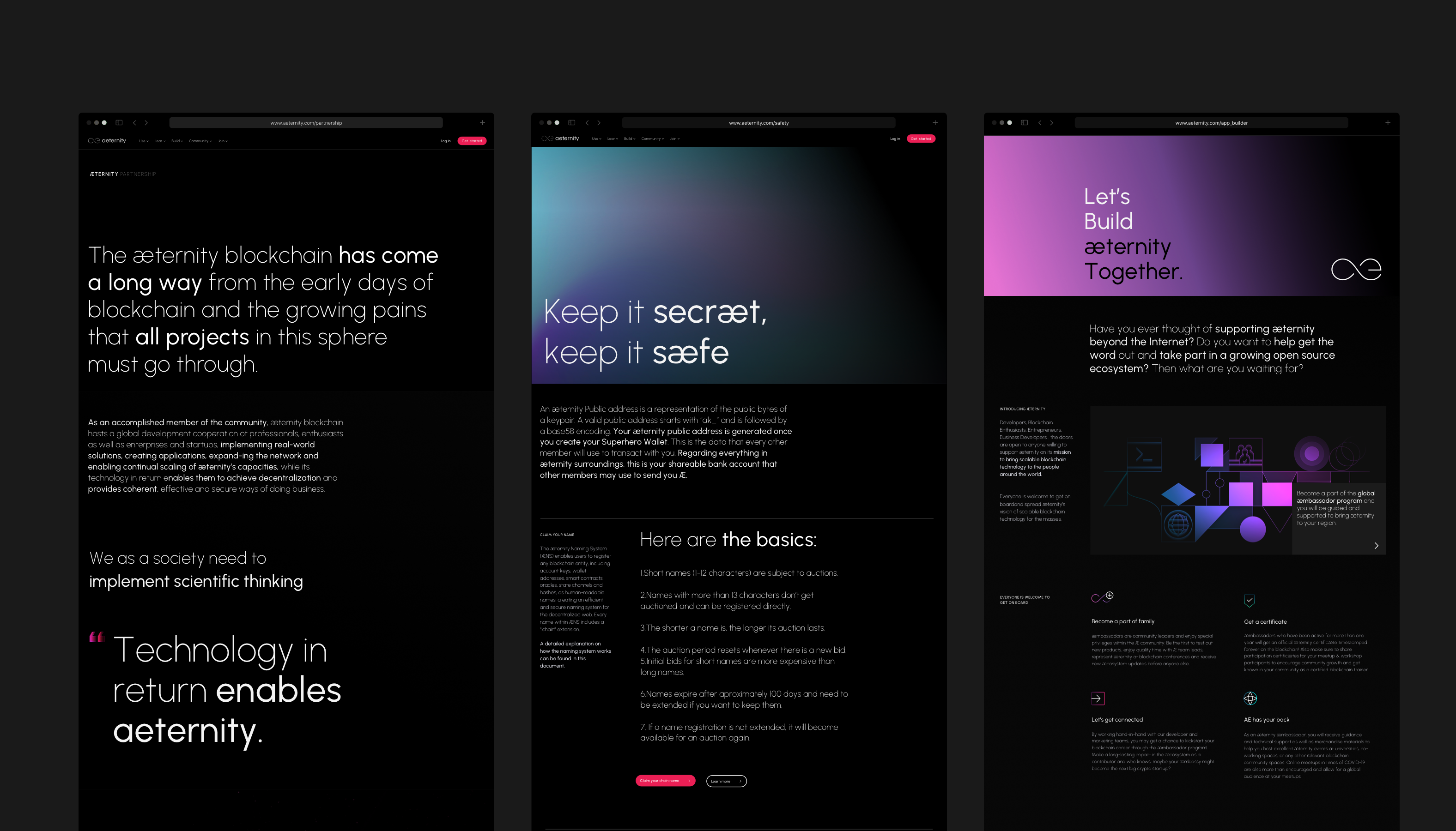
Branding guidelines and corporate Identity
The use of the color pink in the brand's previous color scheme represents a fresh, modern, and innovative approach to technology. The refreshed color scheme builds upon this association and reinforces Aeternity's commitment to progress and change.
The choice of IBM PLEX SANS and IBM PLEX MONO as the brand's font conveys a sense of reliability and stability. The clean, sans-serif design is easy to read and provides a clear, uncluttered look. The use of a popular open-source font emphasizes Aeternity's commitment to transparency and accessibility.
Our Brand Guidelines for aeternity include logos, icons, and other graphical elements that are used consistently across all touchpoints, including the website, marketing materials, and social media. The visual identity should be easily recognizable and memorable, creating a strong connection between the brand and its audience.
Next Case Study
Productsup